Blog
Packaging Artwork Mistakes to Avoid Before Printing
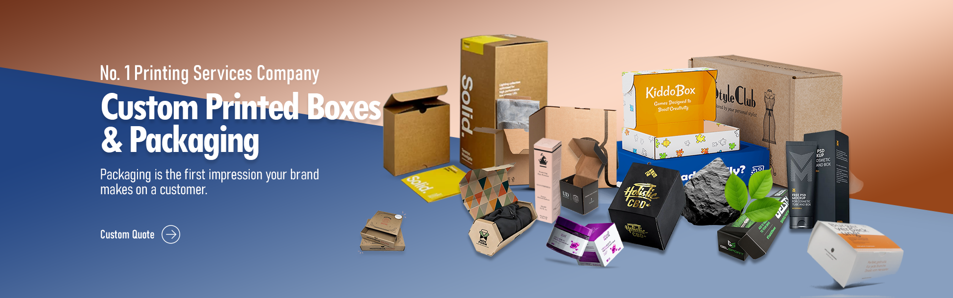
When your product sits on a crowded retail shelf, its design does the heavy lifting. Great artwork grabs attention, shows off your brand, and communicates what is inside while offering a physical layer of protection. Buyers judge your item by how it looks on the outside. A crisp, clear design builds trust instantly and helps your product stand out from competitors.
But a serious problem often ruins this process. Many business owners spend weeks tweaking a layout on their screens, only to receive a final batch of boxes with blurry graphics, chopped-off text, or muddy colors. Printing errors cost money and delay your product launch. You fix this by preparing your digital files correctly before you send them to the printer. Whether you order basic mailers or Perfect Custom Boxes, double-checking your artwork guarantees your final packaging looks exactly like you planned.
Forgetting to Add Bleed Space
Printing machines shift slightly as they pull paper through the press. If your background color stops exactly at the cut line, that small shift leaves an ugly white border around the edge of your box. You prevent this by adding a bleed. A bleed extends your background graphics past the actual cut line, usually by about one-eighth of an inch. When the blade comes down, it cuts directly through the printed color, leaving a clean, continuous edge. Always check your document settings to verify you included this extra space.
Placing Text Outside the Safe Zone
Just as the blade might cut a bit wide, it might also cut a bit narrow. If you put your logo or important text right on the edge of the layout, the machine might slice it off. Every print template has a designated safe zone. You must keep all your vital information, like ingredients, weight, and branding, well inside this boundary. Leaving a healthy margin protects your messaging and makes the layout look neat and professional.
Working in the Wrong Color Mode
Your computer monitor displays colors using red, green, and blue light. Printers mix cyan, magenta, yellow, and black ink. If you submit your files in the monitor’s color mode, the printer software must guess how to convert those colors. This usually results in dull, muddy, or completely wrong shades. You must change your document color settings to match the printing ink before you start designing. Checking your swatches early saves you from a nasty surprise when you open your delivery.
Using Low-Resolution Images
A picture that looks sharp on a website will often look terrible when printed on cardboard. Web graphics only need 72 dots per inch to look good on a screen. High-quality printing requires at least 300 dots per inch. If you pull a photo from the internet and stretch it across a panel on Custom Style Soap Boxes, the result will be a pixelated, blurry mess. Always use original, high-resolution photography or vector graphics. Vector files use math to draw shapes, meaning you can scale them to any size without losing clarity.
Leaving Fonts Unoutlined
You might buy a specific font to match your brand style. When you send your file to the printer, their computer might not have that exact font installed. If it is missing, the system automatically replaces it with a default option, completely ruining your layout. You avoid this headache by converting your text to outlines. This process turns your typed letters into flat vector shapes. The printer can no longer edit the words, but the text will display exactly as you intended, regardless of the computer they use.
Ignoring the Structural Dieline
Boxes fold, bend, and overlap. A dieline is the blueprint showing exactly where these folds and cuts happen. Many beginners design their artwork on a flat canvas and ignore the dieline altogether. When the factory assembles the box, the artwork wraps around corners, or worse, ends up hidden under an overlapping flap. Always place your art directly onto the dieline template. Print a small version on your home printer, cut it out, and fold it by hand. This physical test quickly reveals if a logo sits upside down or a barcode wraps around a sharp corner.
Forgetting to Check Opacity Settings
Designers sometimes use transparent effects or overlapping colors to create shadows and depth. On a screen, these layers look great. On a printing press, transparent layers sometimes print as solid blocks of color, or they block the ink underneath from showing up. You need to flatten your artwork before you export it. Flattening merges all your layers and effects into a single, simple image that the printing software reads easily. This step stops unexpected white boxes or missing shadows from ruining your final product.
Skipping the Final Proofread
Typos happen to everyone. A spelling mistake on a website takes five seconds to fix. A spelling mistake on ten thousand printed cartons is a massive problem. You must read every single word on your package out loud. Ask a friend or colleague to review the text as well. A fresh set of eyes will catch missing commas, swapped letters, or incorrect ingredient lists. You should also test your barcode with a scanner app on your phone. A blurry or stretched barcode will fail to scan at the retail register, causing headaches for store owners.
Sending the Wrong File Format
Printers need high-quality, print-ready files. Sending a standard image file or a basic text document usually results in poor quality. Most professional printers prefer a flat, high-resolution PDF. This format locks in your layout, your outlined fonts, and your high-quality images. Always ask your print provider for their specific file requirements. Following their instructions directly speeds up the process and prevents last-minute rejections. Preparing your artwork properly protects your brand and saves you time and money.